Usability Research For Papa John’s Pizza

This usability research study aimed to understand the ease or difficulty customers can access, use, find information on, and order from the Papa John’s Pizza website. 

The session with users of various demographics, such as age and gender, who have different levels of experience in ordering pizza online, was conducted. Moderators conducted the tests, recorded the tasks, followed a detailed prompt, and consistently approached each task. 

Participants were given three (3) tasks throughout the tests to evaluate the functionality of specific areas on the website. Participants shared insights and immediate impressions about the testing experience, providing a more comprehensive understanding.

Executive Summary

Problem

The stakeholders of Papa John’s want users to find their website and order food smoothly and efficiently. Offer options and engage users with rewards programs without requiring too much information. A usability research test was conducted to understand user experiences and identify areas for improvement on the website. These tests included navigating PapaJohns.com for online orders, signing up for deals, and contacting corporate customer service.

Data Analysis

During the user usability research phase, the participants faced several challenges while completing tasks assigned through the online interface. The standard issue the participant faced navigating the site was finding the rewards programs and contacting customer service. With recorded observations, the findings were positive and negative throughout the ordering process. The tasks performed by the participants were subjected to analysis, considering both success rate and completion time.

Research Methods

Participants of different ages and genders, with varying experience in online pizza ordering, participated in a usability research session and were recorded. The moderators interviewed participants remotely to uncover information about user pain points and behavior when interacting with the Papa John’s website.

Key Findings

  • The menu page was hard to use because there were too many choices, which overwhelmed users.
  • Users are confused with the sign-up process, specifically with submitting their email addresses to access deals and coupons.
  • Corporate contact information is not visible, causing frustration for customers or users trying to get in touch.

Recruitment

The moderators recruited participants near them. Although some questions attempted to identify participants’ online usage, their responses did not determine selection. The moderators coordinate with the participants and establish appropriate timings for the testing process.
Key Recommendations

  • A drop-down menu can make selecting what users want easier without mixing up other choices.
  • Creating a path sequence that differentiates promotions from Papa’s rewards can alleviate the process for users.
  • Creating an accordion feature on the contact page with clear labeling can facilitate users’ easy access to corporate contact information.

Full Report

Website being assessed. The primary objective of this test is to assess the PapaJohns.com website, which is the focus of this evaluation. The goal is to identify how easy it is for users to find, navigate, and order on PapaJohns.com and its rewards programs. Additionally, the test aims to evaluate the ease of communication with Papa John’s corporate customer service. The stakeholders are keen to understand how the site functions and ensure every customer enjoys an experience with Papa John’s website. Methodology Four (4) participants were selected for a usability study and asked to complete three (3) distinct tasks on the official website of Papa John’s Pizza. Before starting the tasks, the moderators asked pre-task questions to understand the participants’ online ordering experience. The moderator led the participants throughout the study, observing their performance during the three tasks. This project’s objective is to understand the user experience concerning the following questions:
  • How proficiently can users place complicated pizza orders.
  • Can users sign up for promotional offers without creating an account?
  • Can users contact corporate customer service if the local store cannot help?
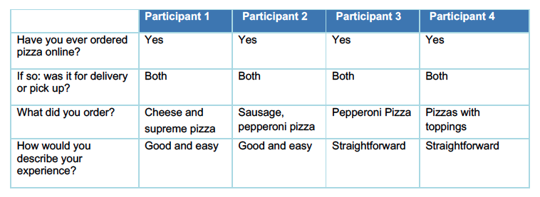
During each study session, the moderators asked participants to “think aloud” to assist in overcoming any usability issues encountered. The participant’s feedback and errors were observed as each participant completed each task. Each study session lasted roughly 10 to 30 minutes, and the participants were encouraged to take their time and not worry about mistakes to help create a relaxed environment. The following table shows pre-task questions on four (4) participants and their experiences using ordering pizza online.

Participant information

The testing group consisted of participants with varying ages, genders, and experience levels with online ordering.

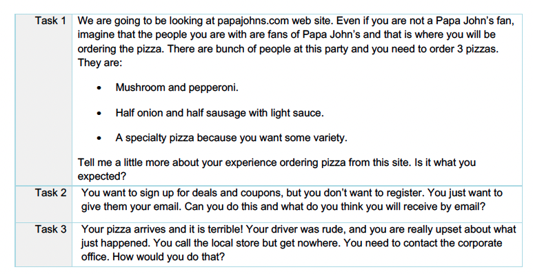
List of Tasks

Moderators recorded tasks, followed a prompt, and approached each task consistently. Participants evaluated website functionality through three (3) tasks and provided immediate feedback. These provided a comprehensive insight into the testing experience.
Synopsis of Findings

During the user usability research phase, the participants faced several challenges while completing tasks assigned through the online interface. The findings provide information to adjust the online interface to ensure users can effectively meet the assigned tasks.

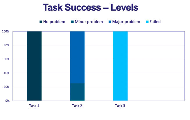
The graph on the left shows:

Two (2) out of the three (3) tasks stumped the users, causing them to experience a sense of frustration—the online interface needed to meet the user needs in those instances. The only area where all participants demonstrated proficiency was creating pizza orders.
Task 1 – Placing Complex Order

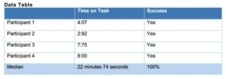
The four (4) participants completed the task assigned, and the time taken to complete the task was approximately under eight minutes.
General Finding

  • Users needed clarification about where to begin their order.
  • Initially confirming the delivery require the full address. Papa John’s does not deliver to a specific zip code.
  • Options can be overwhelming for some users if presented at once.
  • Users prefer to be kept off from being upsold.

Participants Quotes

“Hey, check this out, this new thing out. And I didn’t want that. I was at first kind of confused how to get around that and then I saw at the top, oh, I have to choose pizza.” – Participant 1

“There a lot going on, so it feels it feels a bit overwhelming with all the choices.” Participant 2

“I feel the box is more annoying than anything.” – Participant 4

Recommendation
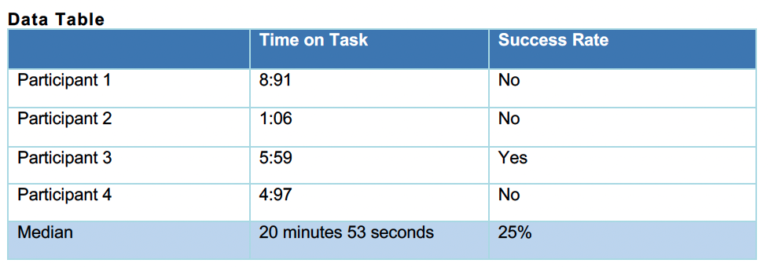
  • Move the ‘Star Your Order” button to the navigation to indicate the starting point.
  • Confirming the delivery area should only require a zip code. To ensure that store can deliver to the entire area covered by a zip code.
  • The menu page was difficult to navigate for users because there were too many options. Adding a drop-down menu option to select the choices and isolate the rest can alleviate the process.

Task 2 – Signing up for Deals and Coupons

Three (3) out of four (4) participants did not complete the task, and it took less than nine minutes.

General Finding

  • Users needed clarification on how to join because there were too many ways to sign up.
  • Users were not –––sure if they could sign up for promotions by using email only.
  • Several users assumed signing up meant getting notifications and spam emails.
  • Users must enter mandatory personal information to sign up for deals and coupons.

Participants Quotes

“It doesn’t appear that I can’t, they make everything mandatory. So like I have to put in my name, phone number, email address, I have to create a password.” – Participant 1

“Should I google it to see if this is even possible.” – Participant 3

“I mean I feel like I would need to create an account. There is email and text email offer down here but even there I need to put my name and information.” – Participant 4

Recommendation

  • Create a streamlined process allowing users to sign up for deals and coupons following one path.
  • Enable users to use an email address only for deals and coupons. This approach presents an opportunity to build trust and allows guests to become loyal customers.
  • Add a message at the end of the email field that explains what users can expect to receive in their inbox after signing up for offers.

Task 3 – Contacting the Corporate Office

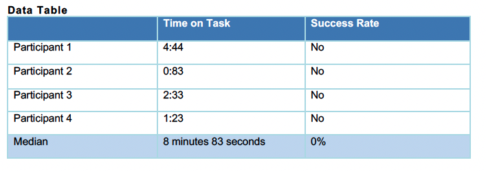
None of the four (4) participants completed task 3. In addition, it took participants roughly less than five minutes to stop trying.
General Finding

  • Users needed clarification on how to join because there were too many ways to sign up.
  • Users were not –––sure if they could sign up for promotions by using email only.
  • Several users assumed signing up meant getting notifications and spam emails.
  • Users must enter mandatory personal information to sign up for deals and coupons.

Participants Quotes

It doesn’t appear that I can’t, they make everything mandatory. So like I have to put in my name, phone

number, email address, I have to create a password.” – Participant 1

“Should I google it to see if this is even possible.” – Participant 3

“I mean I feel like I would need to create an account. There is email and text email offer down here but even there I need to put my name and information.” – Participant 4

Recommendation

  • Create a streamlined process allowing users to sign up for deals and coupons following one path.
  • Enable users to use an email address only for deals and coupons. This approach presents an opportunity to build trust and allows guests to become loyal customers.
  • Add a message at the end of the email field that explains what users can expect to receive in their inbox after signing up for offers.


Follow Up Research Questions

Significant areas require further investigation after the data collected during the usability research. Because of this, a more extensive and in-depth analysis is to adequately explore those areas and gain a comprehensive understanding of the underlying issues. This additional research will provide valuable insights into the user experience, which we can leverage to improve the website in other areas.

  • Do users understand how to start an order? What is the level of experience and familiarity with the platform?
  • Are customers buying more when suggesting additional purchases often?Would signing up for rewards before or after placing an order be more convenient?
  • Are users getting confused between Papa Rewards and promotional offers?
  • What is the process of filing complaints or feedback, and what is the current count submission?